What is better UX?
Contrary to the popular assumption, user experience is not a field limited to software applications, web sites, and web applications. In addition, people mix up UX and UI, which stands User Experience and User Interface respectively.
Let me differentiate UX from UI with an experience I had recently. One of our generous team members bought all of us nice hot coffee from a popular coffee shop. The coffee was scorching hot and it came in a plastic-like paper cup with a lid. When I picked up my cup, I noticed a cylindrical enclosure around the cup. The diameter of the enclosure was larger than the bottom of the cup allowing a consumer to roll up the enclosure up to 80% of the cup’s height, stopping where a consumer holds the cup. It was perfectly designed to prevent a consumer from burning his/her hand when drinking the coffee. The enclosure had a nice design printed on it. Here the enclosure stands for User Experience and the design printed on the enclosure stands for User Interface. A better UX always wins, if you sell it for the right price.
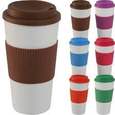
Let’s leave the coffee cup on the table for a moment and focus on delivering better UX to our software consumers. Our software may contain fancy UIs and stylish features, but do they offer a better user experience to the real consumers?
Why do we need better UX for our software?
A “software” is just a collection of codes until it develops the ability to be used efficiently and effectively. To survive the fiercely competitive software market, a software needs to provide a better user experience to the users. Few years ago, software were not so interactive or user friendly. Simply, software those days didn’t deliver a good user experience.How do others provide better UX for their software?
User experience is a very deep subject, and to become UX expert takes a lot of time, experience, and research. To enhance the user experience of a software, it is necessary to survey large user bases. As a pioneer company in the software industry, Google has one of the largest user bases. With petabytes of user data, Google conducts many user-centric research and tests in order to deliver software with delightful user experience. One of their core principles is to Focus on the user and all else will follow. Google wanted to provide consistent user experience to its users across all other platforms and devices. In order to make design consistent, Google came up with a new design concept named Material Design.What is Google’s material design?

Google started working on a new concept named Material Design (also known as Quantum Paper), which they announced in 2014. Material Design is a design language purely based on just Paper and ink. Unlike the real paper, what you see digitally can be reformed or resized intelligently. Material environment is always a 3D space, it has x, y and z axes.
Google Material Design is an outcome of extensive research and testing. Google somewhere mentioned the extent of effort they put to make the Gmail logo adhere to the rules of Material Design. They have created the icon using paper envelop and used different kind of lighting to get the actual shadow, which then they reflected on the Gmail logo.
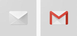
These Polymer paper elements (Yes! that’s how they call the Material Design user interface elements) and ink are subjected to three principles in order to form the Material Design concept.
- Material is the metaphor. “The material is grounded in tactile reality, inspired by the study of paper and ink, yet technologically advanced and open to imagination and magic.” – Google
- Bold, Graphic, and Intentional.“The foundation elements of print-based design—typography, grids, space, scale, colour, and use of imagery—guide visual treatments. These elements do far more than please the eye. They create hierarchy, meaning, and focus. Deliberate colour choices, edge-to-edge imagery, large-scale typography, and intentional white space create a bold and graphic interface that immerses the user in the experience.” – Google
- Motion provides meaning.“Motion respects and reinforces the user as the prime mover. Primary user actions are inflection points that initiate motion, transforming the whole design.” – Google
How fast can we adopt Google’s material design?
I would say that, “it depends” on the following app categories:- Apps that are already up and running
- Apps that you are about to build
Apps that are already up and running
If you application’s front end runs on a commonly used UI framework and the framework is used properly it will be quite easy to align you application with Google Material Design principles. If not, converting your app to Material Design will take time, depending on the scale of you application. Success Story: “In our office we had a relatively very stable web application which was developed for several years. However, the look and feel of the UI was too old, dull and had many other issues. It was a Java application and the front end was built using Bootstrap and jQuery. Initially, the request was to do minor twists to enhance the user experience and eventually we decided to align the application look and feel to Google Material Design. The feasibility study on the app realized that the frontend framework was used quiet well and the code was structured properly and the existence of Material Design plugins for bootstrap. Since this app was on production, we created a separate branch and applied the new UI changes. In less than 2 weeks, we were able to convert all the pages to the new look and feel and within a month, we were able to close defects caused by the new plugin. For an app which was developed for several years, making drastic UI changes within such short period of time with no critical issues was a great achievement by the team.” – MRS Team If you have aligned your application with a proper frontend framework, it will be relatively easy to convert your app to Material Design format with minimal effort.Apps which you are about to build
If your app is still in this state, then you are in a good place as you have the freedom to implement a material based design/implement and use any frontend framework, which suits your requirements. There are few things to consider when you are at the beginning of the project:- Adhere to Material Design concepts when designing.
- Icon usage (Font icons/SVG or raster images).
- Colour usage.
Tools and frameworks
Google’s Material Design concept revolutionized the user interface field. Google aligned all their apps to Material Design, and the concepts eventually became widespread in the software world. Many tools and frameworks were developed to cater the need of switching old UIs to Material Design or to develop Material Design from scratch.For design:
The best tool is the set of guideline developed by Google. Other than that, there are Material Design templates in HTML and PSD formats available in the following web locations:For icons:
I recommend using Google font icons as much as possible (Links is given in the reference section). A wide range of icons available in this repository and new icons are added frequently. Look at the following locations for more icons:Colour usage:
For colour usage, use the Google standards website. Other than that https://www.materialpalette.com is also a good tool.Popular fronted frameworks:
This section lists several full-fledged frameworks available for Material Design. These frameworks house common frontend framework components such as a Grid, UI components, forms and a colour palette.- Angular Material
- Materialize CSS
- Bootstrap/Bootstrap Material Design plugin
- Material UI
- What is better UX?
- Why do we need better UX for our software?
- How do others provide better UX for their software?
- What is Google’s material design?
- How fast can we adopt Google’s material design?
- Apps that are already up and running
- Apps which you are about to build
- Tools and frameworks
- For design:
- For icons:
- Colour usage:
- Popular fronted frameworks:
Related Blogs
Subscribe to our blog to know all the things we do
